Gestalt Principles and the Laws of UX: a guide to usable interface design
A practical guide to applying Gestalt principles and the Laws of UX — with concrete UI applications for each principle, so the theory turns into something you can actually ship.
The scientific principles I use every day designing in tools like Figma were predominantly researched and documented between 1912 and 1960 — before the invention of computers and mobile phones or the gurus of UX at NNG.
Technology changes and evolves at a much faster rate than human behaviour. These principles and laws that govern our behaviour and interactions, researched over the last 100+ years, are still relevant today when designing an app interface, website navigation or a software feature.
I find it fascinating that we digest information on a screen using our eyes, ears and inputs, our brain interprets the information and makes decisions with it — and that it is all predictable with 100-year-old science from before the technology existed.
The documentation of these principles began in 1912 — Gestalt Psychology.
Gestalt Principles
Gestalt principles emerged in Germany in the early 20th century when some bright minds like Max Wertheimer and others were curious about how our brains perceive the world. They figured out that our minds tend to group things together and make sense of patterns, often seeing the whole picture as more important than its individual pieces. These ideas have since been used in various areas, like design and psychology, to help people understand and interact with information and visuals more easily.
These principles tell us things like:
- Similar things belong together
- Things that are close are connected
- We see patterns and continuity instinctively
Laws
As well as the Gestalt principles, there are Behavioural Laws that can also provide us guidance in User Experience. Many of these Laws are well known — Occam’s Razor for example: simpler solutions are preferable to more complex ones.
In this article I have outlined some of my favourite principles and laws, a bit of their history and practical examples of applying the science.
Miller’s Law
The average person can only keep 7 (plus or minus 2) items in their working memory.
Another key principle is Miller’s Law, which predicts that the average person can only keep 7 (± 2) items in their working memory. It originates from a paper published in 1956 by cognitive psychologist George Miller, who discussed the limits of short-term memory and memory span.
Imagine juggling balls. As you get to 5, it becomes difficult to follow, at 7 balls you can just manage and at 9 balls they come crashing down.
Miller also asserted that we can “chunk” information to help us memorise. A simple example of this today is phone numbers which are chunked to help us memorise them. Have you ever noticed if someone gives you a mobile number in the wrong chunks, it is very difficult to remember.
- Australian mobile number: 0401 123 456
- Incorrect chunking: 04 012 3456
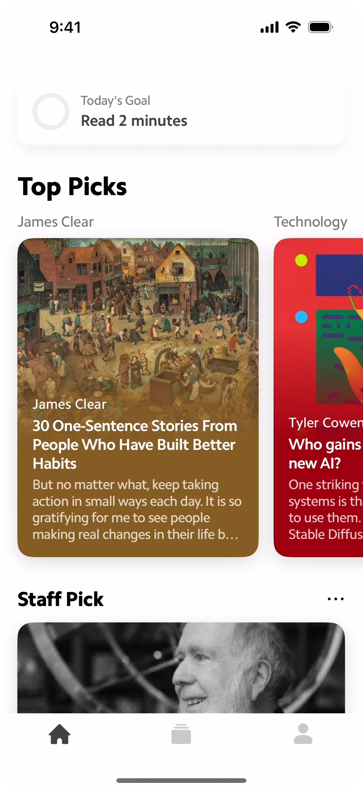
Miller’s Law is very relevant in today’s UI/UX design. A great example is the Netflix home page on your TV or browser. You will notice the screen is split into chunks / rows and there is never more than 6–7 items in a chunk:

Miller’s Law takeaways
- The average person can hold 5–9 items in their working memory at a time.
- Chunking information helps users process and remember complex data more easily.
- Limiting choices to 7 (± 2) items reduces cognitive overload and improves usability.
- Clear organisation of information ensures a more intuitive and enjoyable user experience.
The Law of Similarity
Our eyes tend to perceive similar elements in a design as a complete picture, shape, or group, even if those elements are separated.
In the world of UX, it means that when buttons, links, or icons share similar colours, shapes, or sizes, users understand that they are related and serve a common purpose.
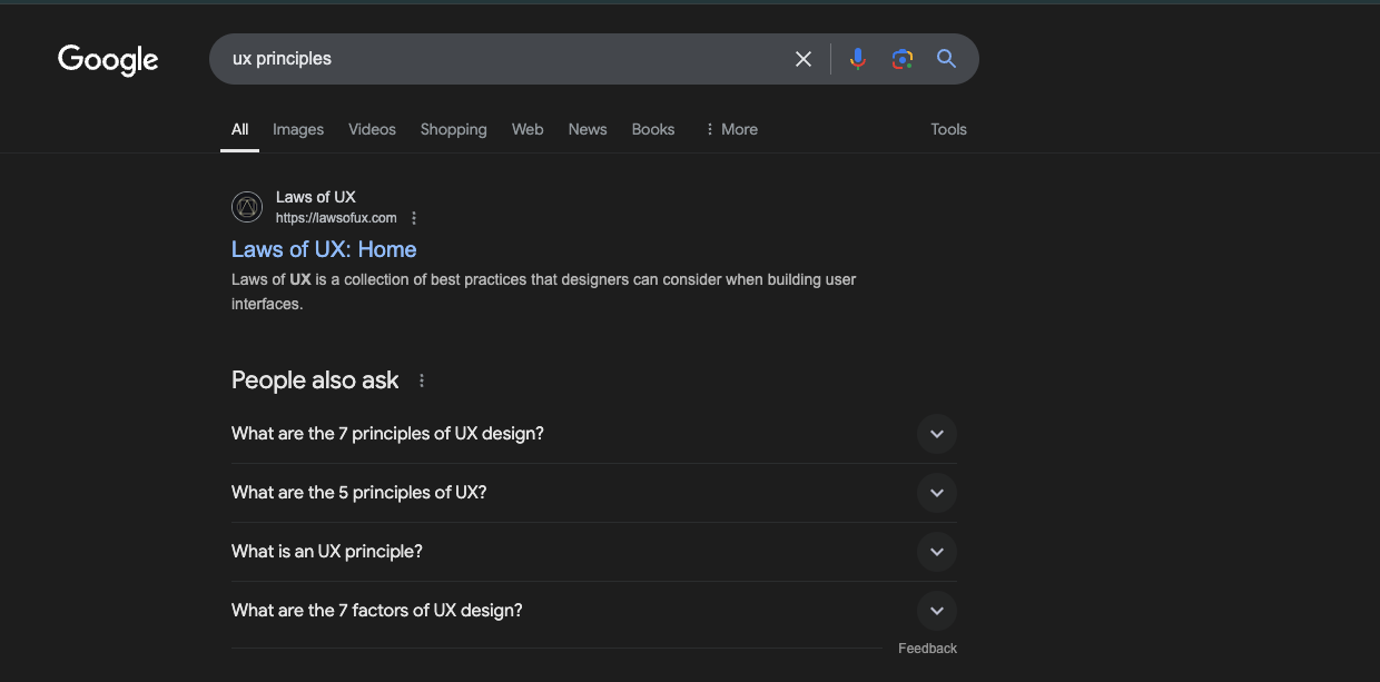
This is why Google groups related menu items together, much like the “People Also Ask” section, to help users quickly identify and navigate through connected topics.
Another example is the Shorts layout in the YouTube app:
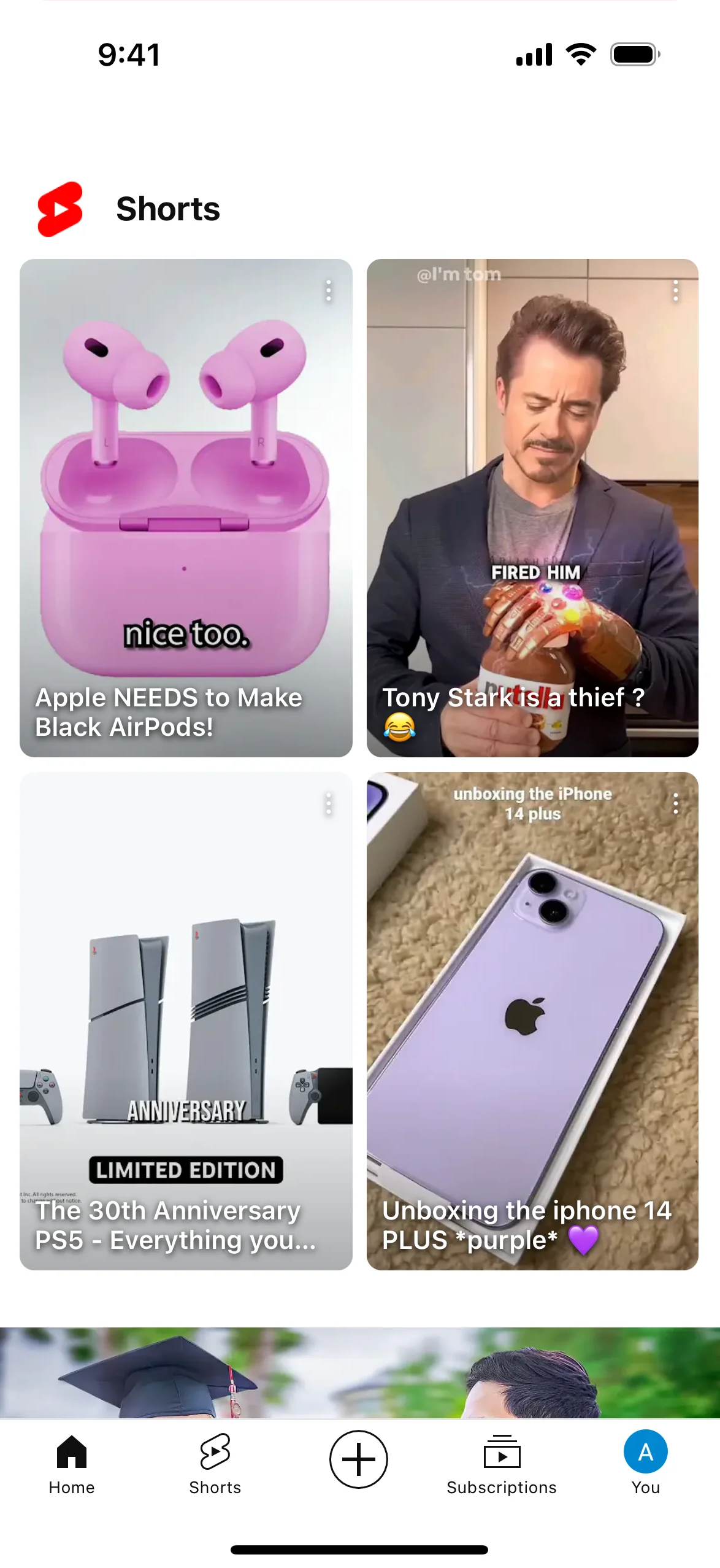
The portrait aspect ratio is visually distinctive, compared to the normal letterbox shape of a video. This helps users visually identify that this is a different kind of content and not a part of the standard video feed.
The Law of Similarity takeaways
- Similarity in design helps users perceive related elements as part of a group or function.
- Using consistent colours, shapes, or sizes creates a sense of connection between elements.
- Contrasting elements can be used to visually differentiate unique content or functionality.
- Grouping related items improves navigation and enhances user understanding.
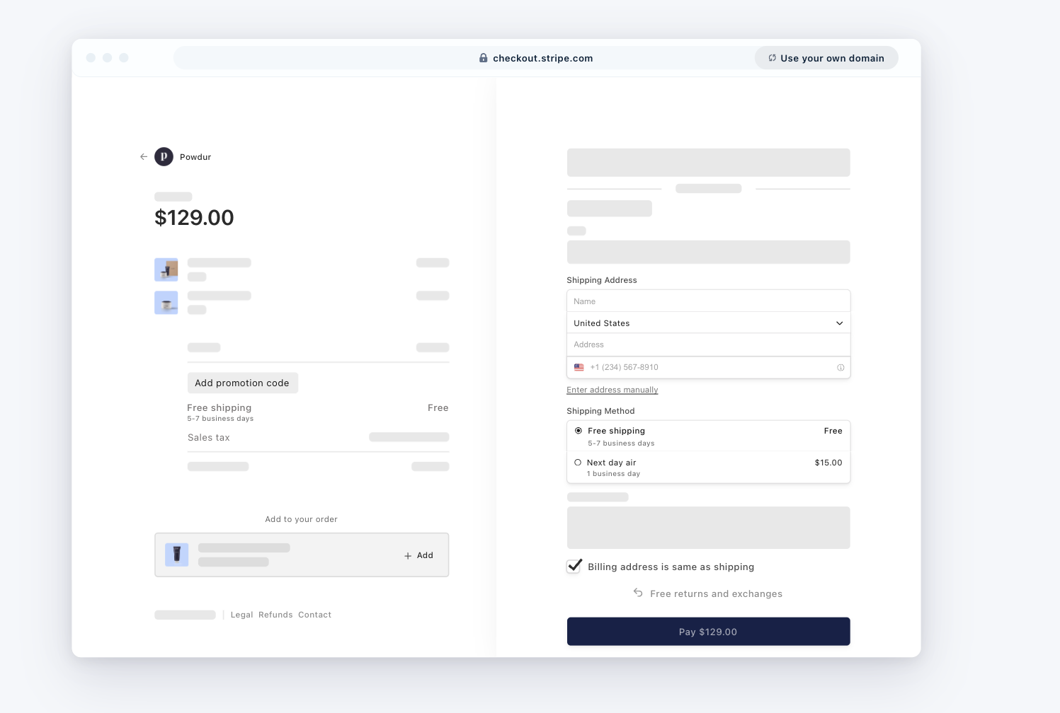
The Law of Proximity
Objects that are near, or proximate to each other, tend to be grouped together.
This principle tells us that things close to each other are seen as connected. In UX design, it’s about placing related elements together. For instance, if you have a profile picture on a social media app, the username, message button, and friend request button should be close by, so users know they are connected to that profile. This makes it easier for people to navigate and interact with the app.
On Stripe’s checkout page, the ‘Amount’, ‘Promotion Code’ and ‘Payment Method’ are grouped in the left hand column. The form fields for “Shipping Address” and “Shipping Method” are grouped closely together in the right hand column.
The Law of Proximity takeaways
- Proximity helps to establish a relationship with nearby objects.
- Elements in close proximity are perceived to share similar functionality or traits.
- Proximity helps users understand and organise information faster and more efficiently.
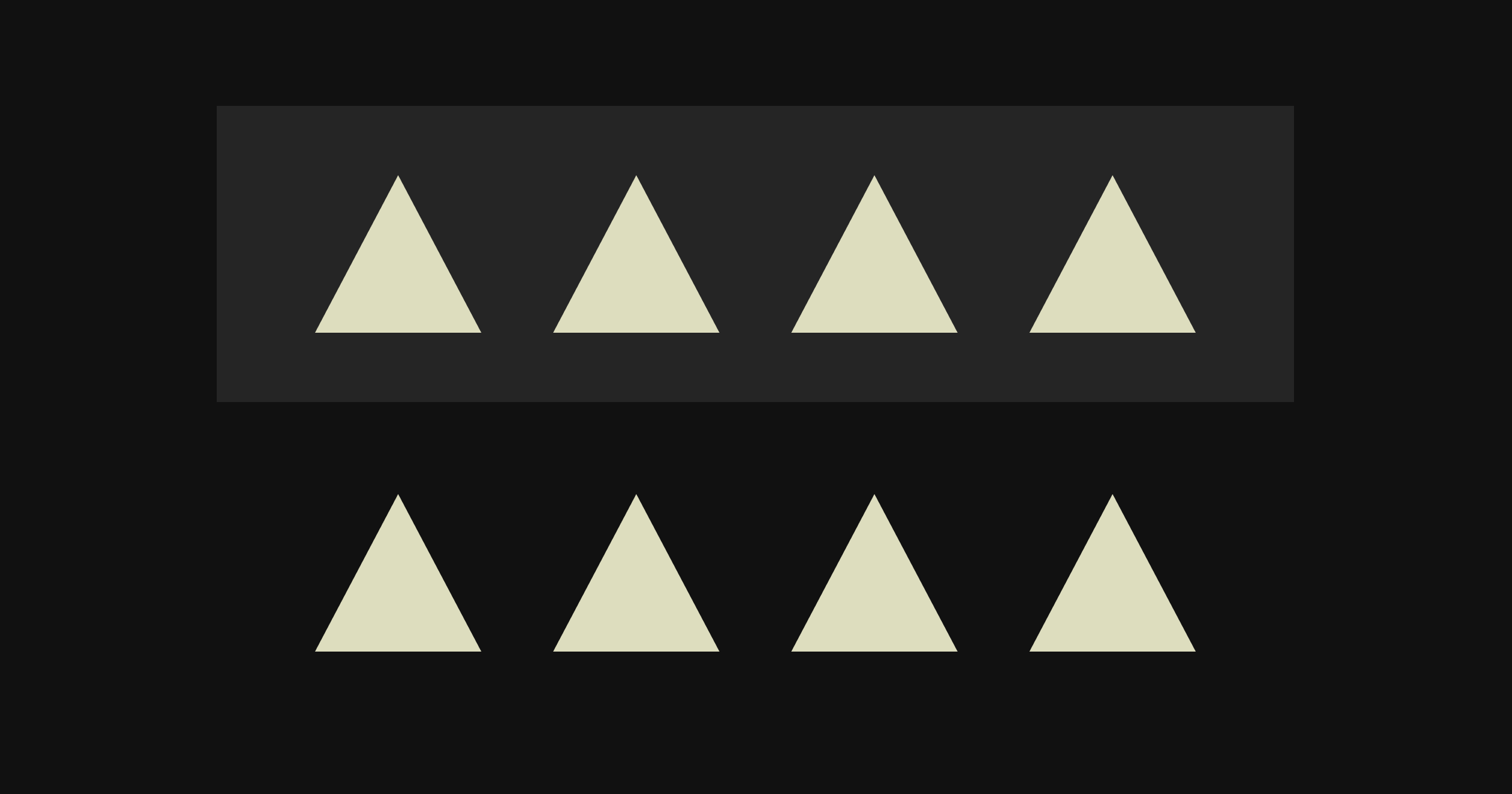
The Law of Closure
Our visual perception unconsciously completes incomplete objects.

Our brains are adept at interpreting incomplete visuals as complete ones, a principle that’s invaluable in UX design. Take the example of a progress bar in a form: it may not be fully filled, but as you advance through the steps, your brain instinctively ‘completes’ the image. This ability allows you to effortlessly track your progress, ensuring you remain informed and engaged throughout the process.
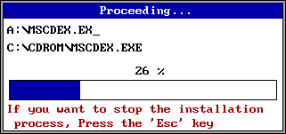
A Windows 3.1 message box with a progress bar
The power of closure in modern interfaces extends far beyond simple progress bars. Think about how mobile apps handle image carousels — showing just a slice of the next image at the screen’s edge. Your brain automatically registers that there’s more content to explore, without the need for explicit “swipe for more” instructions.
Matter, app homepage
When designing navigation menus, the principle becomes even more fascinating. Take the ubiquitous hamburger menu icon — three simple lines that our brains instantly recognise as a button that reveals more options.
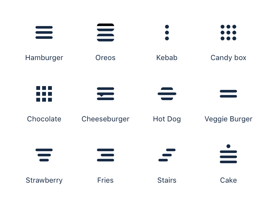
The versatility of this principle is on show above — take the ‘stairs’ icon, where a few diagonal lines efficiently convey elevation and progression. The ‘cake’ icon uses horizontal lines with a single dot on top — our brain doesn’t need the full outline of a cake to understand what it represents.
The Law of Closure takeaways
- Our brains automatically complete incomplete shapes and patterns to form whole objects.
- Simple, incomplete forms can be more effective than detailed illustrations in interface design.
- Strategic use of gaps and spacing can create meaningful icons while reducing visual complexity.
- When objects are incomplete but recognisable, users process information more efficiently.
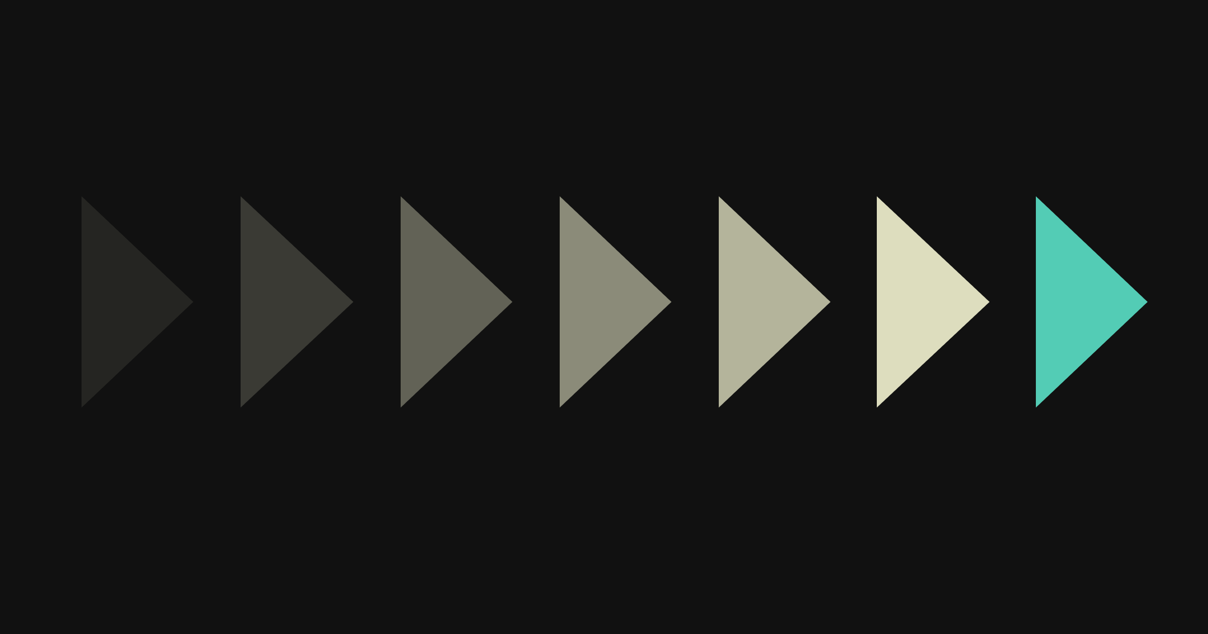
The Law of Continuity
Our eyes track continuous forms and look for breaks in them.
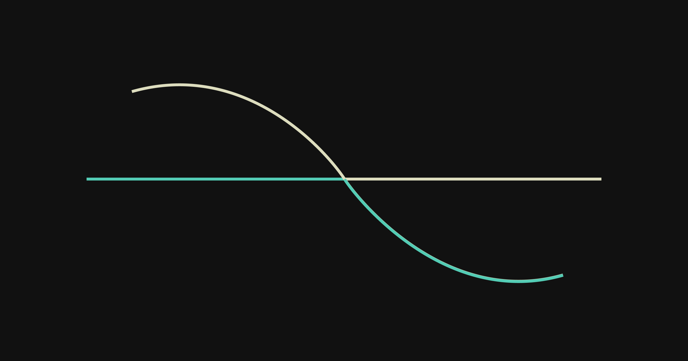
In the image shown, most people will naturally follow the curved line across the straight one, even when the colours change. This behaviour is partly because we’re used to seeing our world in straight, horizontal lines, which influences how we group elements visually. In UX design, this insight is super useful for guiding users along a process or showing them a clear pathway.
Design by Sebastiano Guerriero from Dribbble
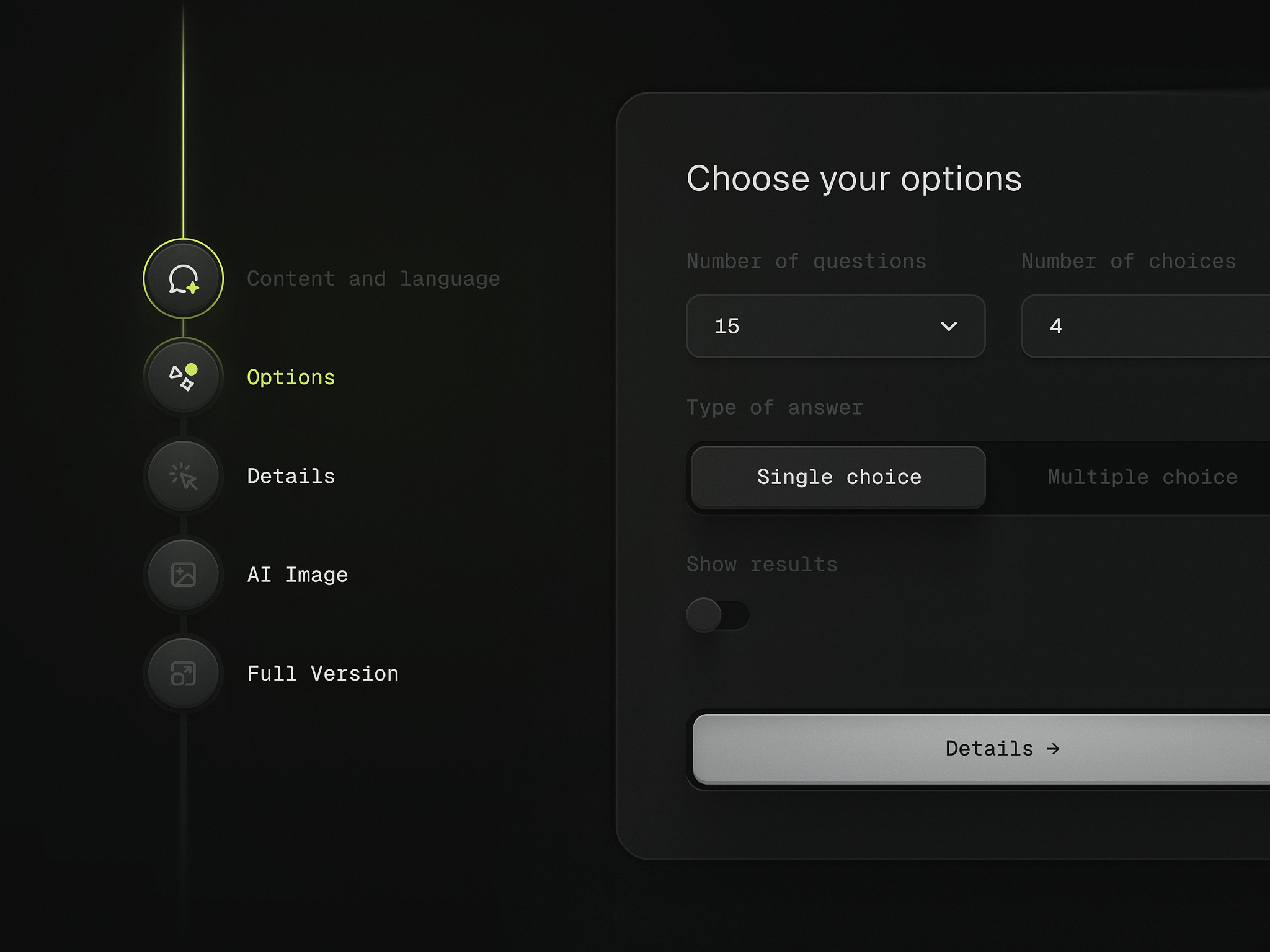
In the above image, look at how the vertical line connects each stage of the setup process. Our eyes naturally follow this path downwards, instantly understanding the sequence and our position within it.
The Law of Continuity takeaways
- Our eyes naturally follow lines and paths through an interface.
- Continuous elements help users track their progress through a process.
- Connected steps make complex sequences feel more manageable.
The Law of Figure-Ground
We perceive separation between the foreground (figure) and background (ground).

In UX design, it’s vital to ensure the important stuff stands out. Think of a search bar on a webpage. It should be the ‘figure’ that users notice first, not lost in the ‘background’ of the page.
This law is everywhere in User Interface design — it is what we use to bring items forward or move them backwards. It is a part of every design system in UI elements like cards, tooltips, buttons, surface/paper and modals.
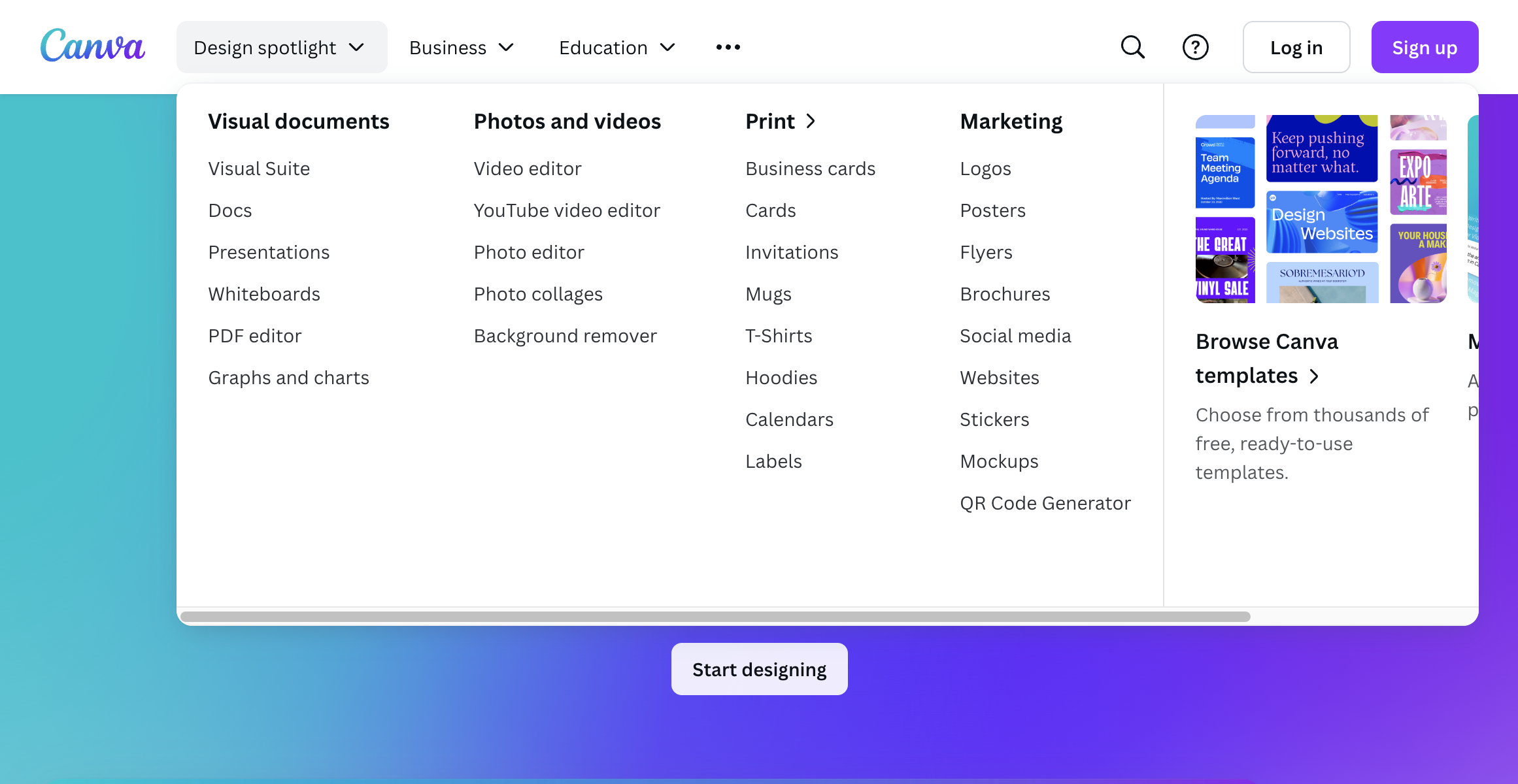
Source canva.com
In the Canva example, the dropdown mega-menu uses a drop shadow to bring the content forward in a 3D manner, allowing users to clearly understand how to navigate the website.
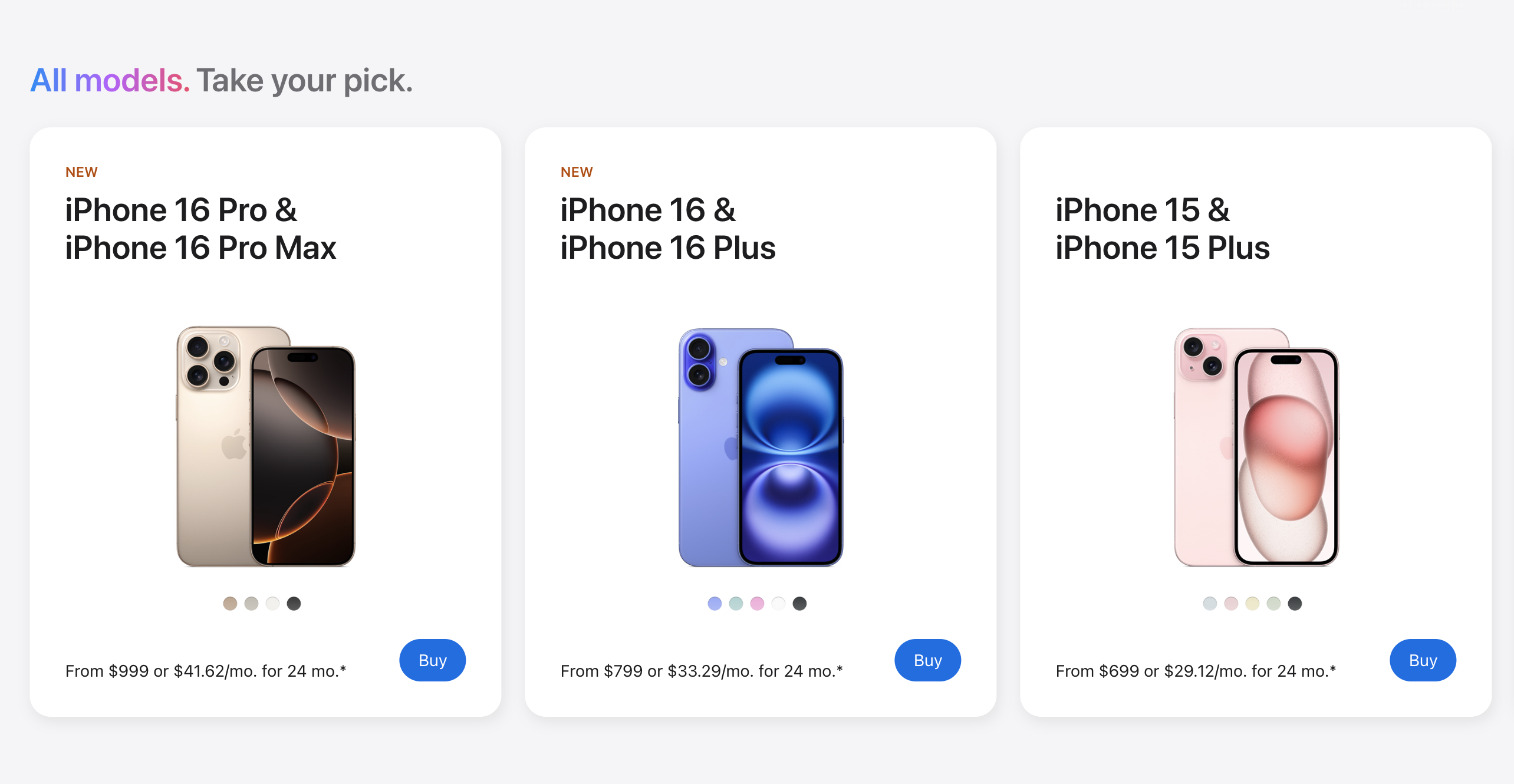
Source Apple.com
Apple uses white cards with subtle shadows to showcase different iPhone models, creating clear visual separation between product options.
The Law of Figure-Ground takeaways
- Our brains separate elements into foreground and background.
- Lighter elements appear to come forward while darker ones recede.
- Drop shadows help create depth and visual hierarchy.
- Cards and containers help organise content into distinct sections.
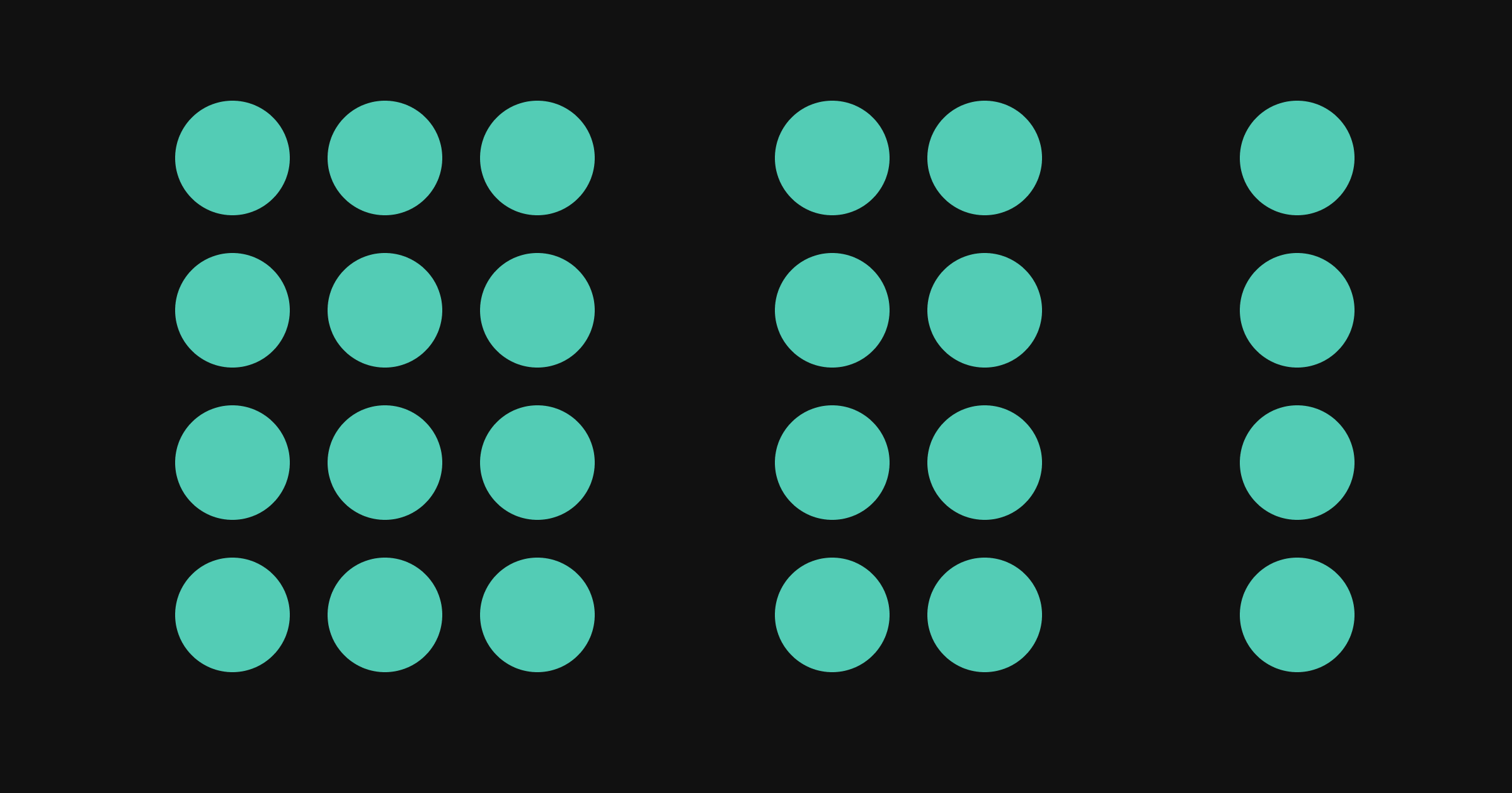
The Law of Symmetry
Objects, perceived by the user to be similar, group together.

The Law of Symmetry states that we inherently find symmetrical shapes and structures more aesthetically appealing, well-balanced, and orderly compared to their asymmetrical counterparts.
Symmetry in UX design brings forth a range of benefits:
- Visual harmony
- Clear navigation
- Usability
- Don’t make the user think!
- Aesthetic appeal
- Creates hierarchy
- Simplifies user comprehension
- Maintains design consistency
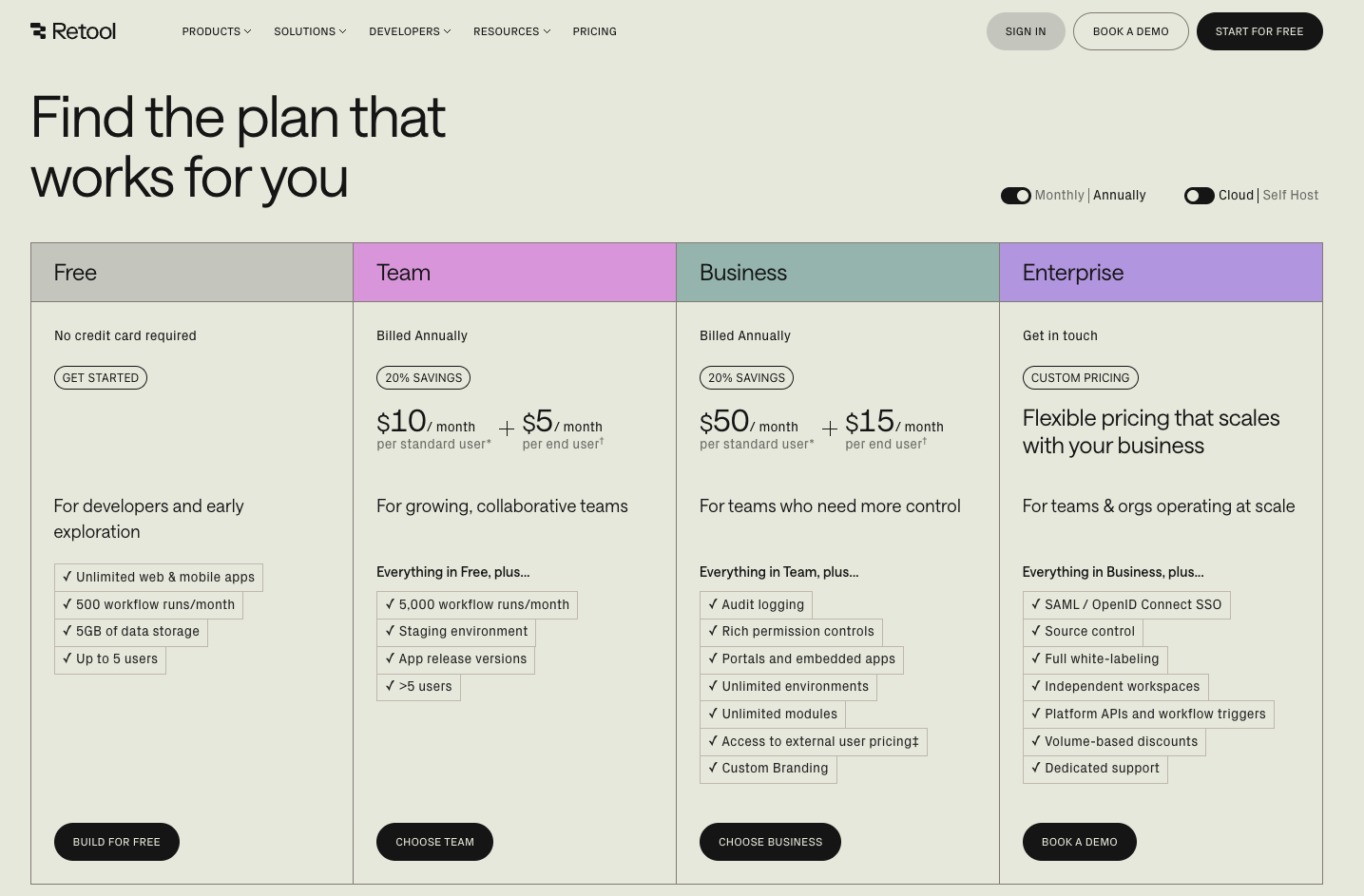
In the below example, you can see how the symmetry makes it clear to the user that there are four pricing tiers and which areas of the tiers are comparable.
The Law of Symmetry takeaways
- Our minds naturally group symmetrical elements together.
- Balanced layouts create a sense of order and stability.
- Symmetrical design makes comparison easier for users.
- Visual balance helps users process information quickly.
The Law of Common Fate
Elements tend to be perceived into groups if they are sharing an area with a clearly defined boundary.
These principles boil down to five main ways we group things: by how close they are (Proximity), how similar they look (Similarity), how they flow (Continuity), how we complete partial shapes (Closure), and how they connect (Connectedness). The Law of Common Fate builds on this by showing how elements that move or function together are perceived as a group.
Google, Apple and Microsoft use this principle to help users identify their apps in a sea of brands:
The Law of Common Fate takeaways
- Elements that share a space naturally feel connected to users.
- Borders and boundaries help users understand what belongs together.
- Consistent backgrounds group related content effectively.
- Similar styling tells users “these things are related”.
Goal-Gradient Effect
The tendency to approach a goal increases with proximity to the goal.
Think about that feeling when you’re filling out your LinkedIn profile and see it’s at 90% — suddenly, you’re determined to add that last missing detail. This powerful psychological principle was first spotted by Clark Hull in 1934 when he noticed rats in a maze would run faster as they got closer to their food reward.
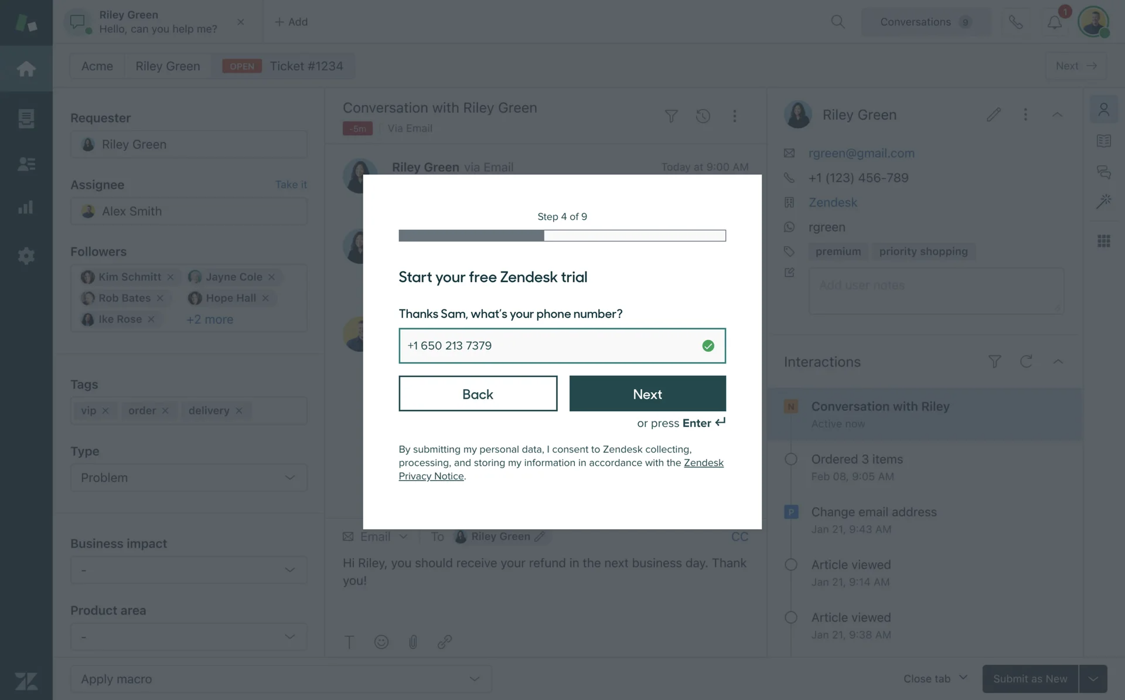
Zendesk free trial onboarding
Progress bars, achievement badges, and profile completion meters all tap into our natural drive to finish what we’ve started.
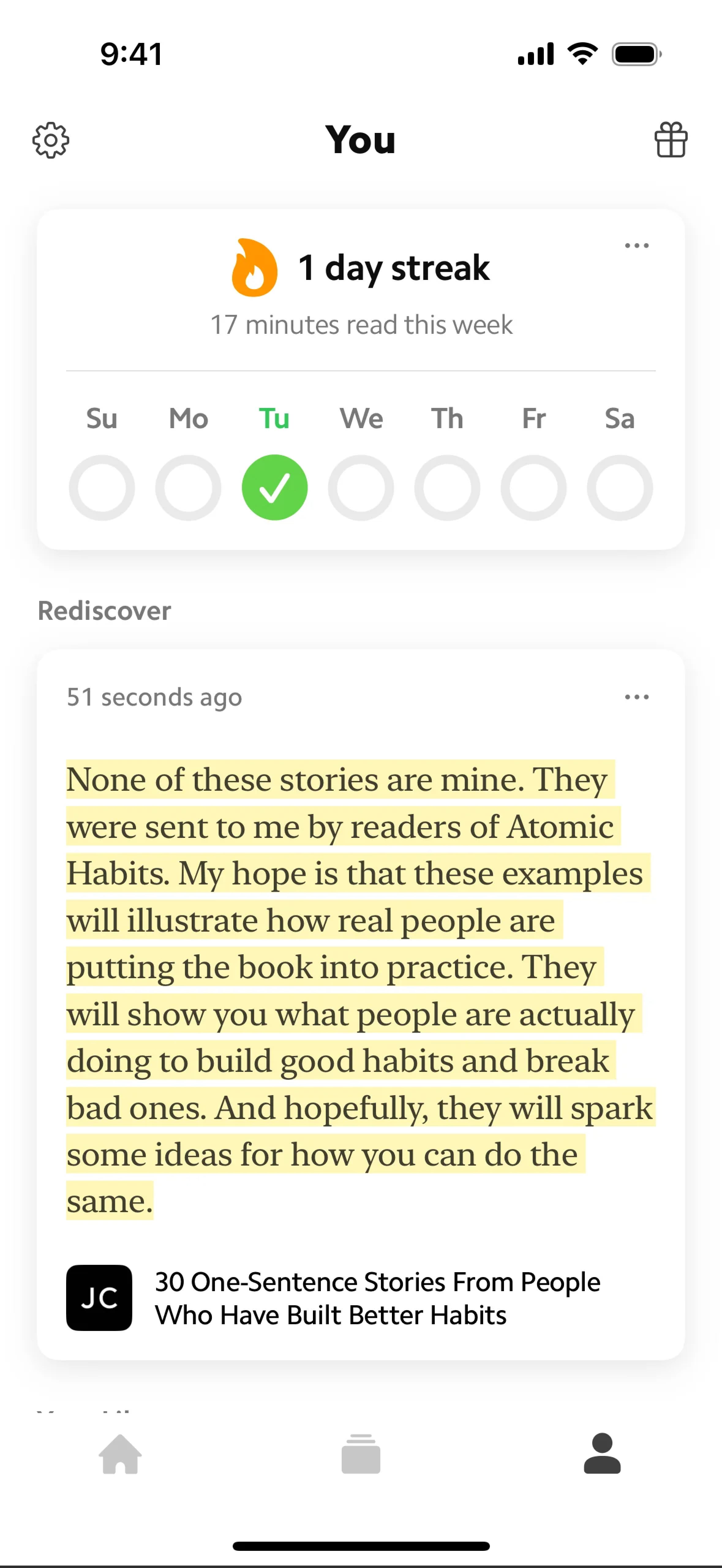
Daily streak counter on Matter App
Daily streak counters and level progression systems aren’t just pretty graphics. They’re carefully crafted to show you exactly how close you are to reaching your next milestone, making you more likely to complete “just one more lesson” to keep your streak alive.
The Goal-Gradient Effect takeaways
- Users naturally speed up their efforts when they can see the finish line.
- Progress indicators motivate users to complete tasks.
- Breaking large goals into smaller milestones maintains momentum.
- Clear visual feedback helps users stay engaged.
Final thoughts
We use screens throughout our day without conscious thought about how they work. My three-year-old perfectly illustrates this natural interaction — confidently navigating her iPad and swiping through apps with ease. When she tries to swipe the TV screen, expecting it to respond like her tablet, it demonstrates how deeply these interface design principles have become embedded in our behaviour, even from our earliest interactions with technology.
That natural, intuitive feeling when using a well-designed app isn’t accidental — it’s the result of understanding and applying these time-tested principles. While the technology we use has changed dramatically since these laws were first discovered, the way our brains process information hasn’t.
Understanding these fundamental principles helps us create better digital experiences. Whether you’re designing a simple website or a complex application, these laws provide a reliable framework for making design decisions that align with how users naturally think and behave.
These scientific principles can be directly translated to screens, and is how a book like Steve Krug’s Don’t Make Me Think is still relevant today. It was originally released in the year 2000.
Further reading:
- The Laws of UX website: lawsofux.com
- Steve Krug’s Don’t Make Me Think
- Interaction Design Foundation: The Gestalt Principles